Autumn Pixels Home

Category

Design & Creative

3 articles

Stuck in October: Why Autumn Aesthetics Keep Hijacking Your Off-Season Creative Work

Stuck in October: Why Autumn Aesthetics Keep Hijacking Your Off-Season Creative Work

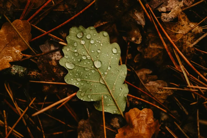
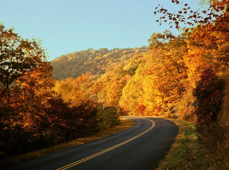
There's something strange happening in design studios across the country — it's June, the brief calls for something fresh and summery, and yet the mood board keeps drifting toward burnt sienna and dried botanicals. The pull of autumn aesthetics is real, surprisingly persistent, and worth examining honestly. Here's why fall keeps showing up uninvited, and what you can actually do about it.

Rooted in Rhythm: How Digital Artists Are Using the Seasons as a Creative Framework

Rooted in Rhythm: How Digital Artists Are Using the Seasons as a Creative Framework

Forget waiting for inspiration to strike — a growing number of digital artists are building their entire creative practice around the natural calendar. We talked to five working artists about how seasonal rhythms shape their workflows, tools, and long-term sustainability. Turns out, the seasons aren't just pretty backdrops — they're a full-on creative strategy.

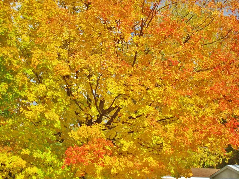
Burned In: Why Rust, Ochre, and Amber Keep Haunting Our Design Choices Year-Round

Burned In: Why Rust, Ochre, and Amber Keep Haunting Our Design Choices Year-Round

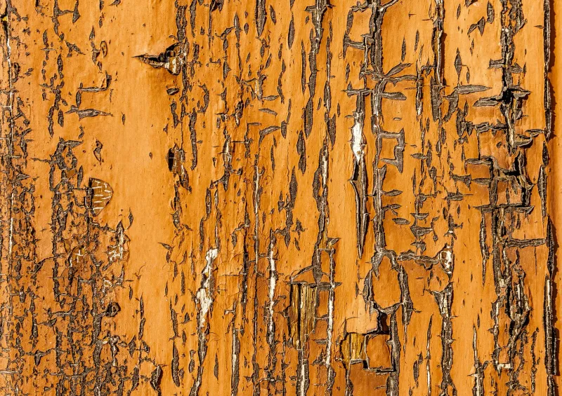
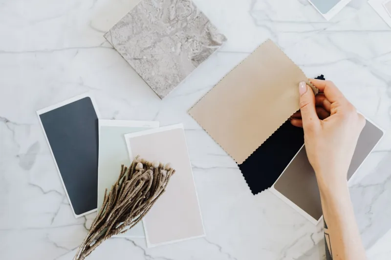
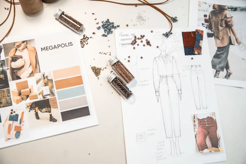
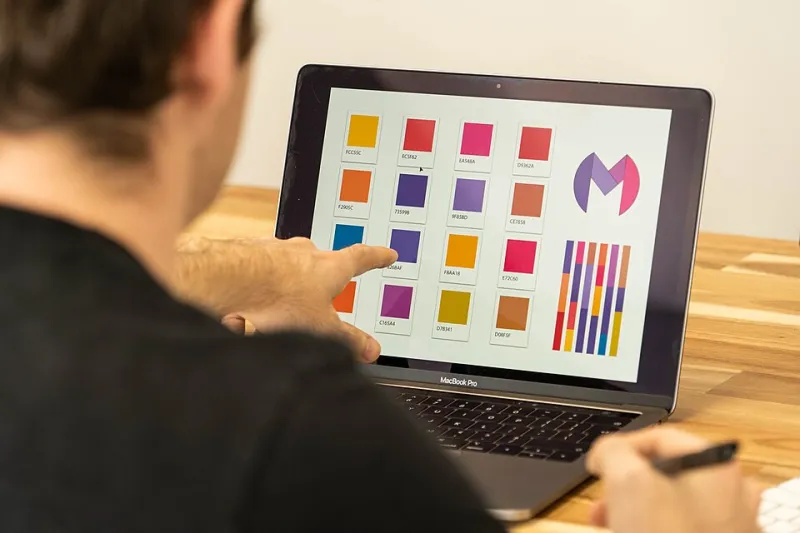
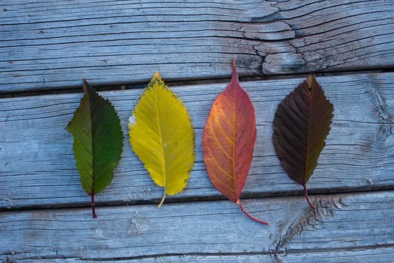
Walk through any design portfolio, scroll any brand mood board, or flip through a fashion lookbook from 2024 — chances are you'll find burnt orange, deep ochre, or warm amber somewhere in the mix. This isn't a seasonal trend. It's something deeper, something almost hardwired into the way we respond to color. We dug into the psychology, the cultural context, and the design industry itself to figure out why autumn tones refuse to leave.